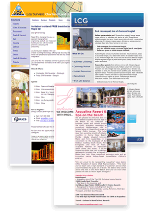
The Creativity of Holiday Marketing
by Annie Cooley
The design of your email campaign this holiday season will be what catches the attention of your readers right off the bat. Alex Williams of MarketingProfs says, “Quality design helps present your brand in a positive way, separates you from competitors and helps increase sales.” He goes on to explain that small design changes will help your email campaigns look that much more engaging.
Here are a few design principles to focus on during the holidays:
A Fresh Look
 Holiday marketing is the perfect time to give your email campaign a fresh look. By making small changes to the layout of your email, you can catch the attention of inactive email recipients. People tend to notice change and will often take a second look.
Focus on maintaining good color choices and offering enough white space to make it look composed and engaging. With that, add graphics that are eye-catching. A holiday theme is always a safe bet. However, remember to center whatever theme you may have on your products, services or promotions.
If you need a good and free resource for color schemes, check out Kuler.
Balance and Scannability
Every email template needs an appropriate text and image hierarchy. Do your content and images guide the reader to important information or do they look like separate entities on a page? Balance is discovered in different ways depending on your email design intentions.
If your email is text heavy, balance needs to be in the layout of each content section. Is your email easily readable and scannable? Can people understand your theme just by scanning the headlines of your sections? If you are using images, do they further the story and interest? If your email is centered on promotions or products, the balance is more heavily influenced by graphics and buttons. Is there a clear focus of what you are promoting? For the holiday season, minimize what you showcase in order to maximize the reader’s attention.
Having trouble? Step away from designing your email for twenty minutes. When you return, think about how your eye moves from each section of your email. Have you found an appropriate focus or do your eyes seem to jump around too much?
Clickability
Clickability deals with how accessible and action-driven your links and buttons are. This not only covers the language used within the link but the graphics and placement of each one. The language should be nothing but actionable. In other words, don’t merely say ‘Click Here;’ say ‘Get your discount’ or ‘Buy Now.’ Use the same action verbs between graphic links and text links. Graphics should be bold and noticeable. A brightly colored, simple shaped button is ideal. Graphic links should be aligned with the promotion they refer to. Proper placement includes the top of the email, below the promotion or featured in the side bar. Text links should be placed after the content describing the call to action and are essential if images do not appear.
Let your personality shine
What to keep in mind is that no matter what you do, embrace what your company has that makes you stand out beyond your competitors. This can be as serious or off the wall as you want it to be. You can create this presence through images and content. Make photographs of your company or a particular occasion part of your email. Highlight your products or services in a unique way. Embrace your look and, for holiday’s sake stand out.
Remember: Make sure that your email still looks visually appealing even if the images do not show up for whatever reason. Is there still an apparent call to action and objective present within your email? If so, you are ready to send away.


