Drive Clicks with These 7 Email Design Tips
by Audrey Howes

One of the best ways to measure email success is through clicks. Since getting clicks is usually the main goal of an email, we’ve compiled some of our best tips for how to design your email to drive clicks.
Keep it Simple
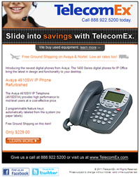
In email design, keeping it simple is key. Wed all like to think we create such amazing emails our recipients cant help but digest every word. Unfortunately, its just not true. Recipients dont really read emails, they scan emails. By keeping your email simple and to the point, you are more likely to communicate your message to all of us email scanners. Shoot to keep paragraphs at no more than 3 sentences and include bolded headlines to help guide the scanning process. Add relevant images to support your message.
Spread the Opportunity
The call to action is the part of your email where you ask your recipient to take an action. Usually the call to action involves a click to get more information, register, enter to win, or buy now. Present your call to action in a variety of locations and forms to ensure it gets the attention it deserves. Consider starting your email with preheader text with your call to action, use a button or other image as a call to action in the main message area and even include a text link within your copy for a click through opportunity. Spreading out the call to action increases your likelihood of receiving more clicks.
Guide The Eye
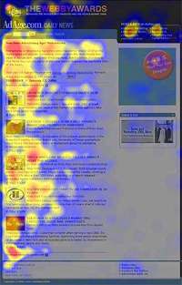
Studies show the human eye reads over emails and webpages in an F pattern (source). Place your most important information in the upper left quadrant of your email. Include your logo, main messaging and call to action in that area. Dont neglect the lower portion of your email as it does still receive some scanning. Be sure to add a call to action in the lower quadrant to capture those recipients who do read the whole shebang.
Dont Recycle, Rewrite
It can be tempting to reuse the same promotional copy and just make small edits at each send. The problem with this method is your recipients are smarter than that. Over time, they will notice the same copy being used and will gradually lose interest in your email communications. It may take more time, but putting a fresh spin your copy for each email will drive more clicks.
 It's Urgent
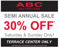
For promotional and sales emails, include a sense of urgency in your design. Putting a short deadline on an opportunity such as 48 hours or 1 day, encourages your recipients to click through. If you give your recipients too much time to decide, it is more likely that they will forget about your offer.
P.S.
One way to push hesitant recipients over the clicking edge is to include a P.S. at the end of your email. Try to answer the main objections you can think of which would cause a recipient not to click. Another way to use the P.S. is to include a customer testimonial such as, Dont take our word for it, see what our customer Bob Boberton has to say. Link the P.S. to the testimonial or main call to action. The P.S. can also help recipients remember a human being is writing the email, not a robot.
Test It!
We know this point may fall on deaf ears as we harp on testing a lot. Well deaf ears, LISTEN UP! Testing can make the difference between a few clicks and a ton of clicks. Create a couple of different versions of your email and send to small segments of your list. See which works best and use that email for the remainder of your list. Before sending any email to your list, send it through a spam checker and to multiple email clients to make sure it renders well.
So there you have it. Apply these ideas to your email marketing campaigns and watch your clicks skyrocket!


