In the guide, Startups: This is How Design Works, Wells Riley uses this definition for design:.
De•sign [dəzajn] is a method of problem solving.
The simplest definition. Design is so many things, executed in many different ways, but the function is always the same. Whether its blueprints, a clever UI, a brochure, or a chair design can help solve a visual or physical problem. (source)
Just as with a blueprint or a brochure, design is essential in email marketing. A well designed email begins to solve the problem of spam filtering and leads to more clicks and ultimately more customers. But how do we get there? How do we, the little guys, design good emails?
Before You Design
- Start with an objective. Why are you sending the email? What is the goal? Design becomes easier when you have an objective in mind.
- Consider the type(s) of content you will be sending. It will help direct your design efforts.
Major in the Minors
- Match your current branding. Use colors, fonts and language that aligns with the branding seen on your website, brochures and other marketing materials.
- Dont copy and paste text or HTML directly from Word. It will bring in unwanted tags and can greatly affect your email design and break your code.
- Emails should be no larger than 600 pixels wide. [Hint: We've designed all Swiftpage emarketing email templates at 600 pixels wide.]
- Ditch the weblike navigation. Most of the time it doesnt render well on mobile devices and its hard to click with a finger
Add Images to Add Value
- Put your images on the left and text on the right. Images help guide the eye to the text.
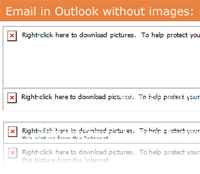
- Design assuming images wont be seen. Many email clients turn images off by default. Make sure all of the key information is clear without images.
- Select images to help tell the story of your email. Dont put in images just to have images. They need to add value to your message, or they will just act as a distraction.
Capture the Click Through
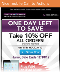
- Use clear, large calls to action (CTAs). CTA buttons should be at least 44 pixels square to be friendly to mobile users.
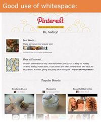
- Let there be white space. Design with intentional spacing to allow the eye to rest and to make CTAs and other links more visible.
- If you use images of people, try to have their eyes pointing in the direction of your CTA. We tend to follow the direction of eyes when we look at an image. (source)
Create Concise Content
- Avoid overly large fonts. Using fonts above about 24 pixels takes up too much valuable real estate in your emails and makes it look like you are screaming at your readers.
- Keep your copy to about 3 lines per section or paragraph. This makes scanning easier and is friendlier for your mobile readers.
- Write headlines for your articles that are short and sweet and draw attention to your articles. Headlines help to guide the eye through an email.
- Don't include full articles. Use teasers or a snippet from your article with a link to Read More or Keep Reading. Using links also helps with your analytics.
Before You Send
- Show your email to a colleague or two. Take their feedback to make corrections or adjustments where needed.
- Test your email in various email clients and on mobile devices. Make sure it renders well or make changes before your final send.
- Check all links to ensure they direct to the correct website or landing page.
Your recipients receive hundreds of emails every day. Use these tips to create emails that will stand out in inboxes and make us and your recipients smile.
We'd love to see what you've got! Send us a copy of your email to newsletter@swiftpage.com. A lucky few will receive a free email design analysis.


